
On 20 September 2021, MyCarSpot will become Sharvy and change its logo; an evolution that aims to accompany the expansion of the application’s functional coverage beyond company car parks and that will allow to accelerate its international development. This graphic identity redesign work was entrusted to the Use.Design agency.
A multi-service personal assistant
Originally, the MyCarSpot brand explicitly promised “a place to park” with a logo incorporating the Parking symbol. We have won over a hundred customers across Europe and now manage 20,000 car park spaces. But since last year, thanks to our fundraising and to support companies in their new work organisation with the health crisis, MyCarSpot has continued to expand its services, and this name had become too narrow to cover the functional extensions. In fact, today we are already optimising the occupation of over 55,000m² of offices spaces in France and Europe.
The new name, Sharvy, refers to “to share” in English, and can be associated with all the contexts of use already existing in the application – car park, office, canteen – or to come… With these two easy-to-remember syllables, employees will think of a personal assistant, which allows them to ask for help, to facilitate and fluidify their daily life in the company:
- Sharvy, can I get a car park space?
- Sharvy, find me a slot for 4 in the canteen.
- Sharvy, etc.
Ready to accelerate internationally
The new brand, with its Anglo-Saxon sound, crosses borders and is in line with the company’s international development.
« With more than 30% of our turnover already generated internationally, the application is available in 6 languages and is used in about 10 countries. The aim is to strengthen our presence in Europe and to conquer new countries in the coming months, particularly the United States. It was essential for us that this new identity and this new name also respond to this internationalisation.»
Stéphane Seigneurin, founder of the company
A new logo accompanies this change
A punctuation element has been added to the logo: the comma. Announcing a continuation and a breath in a sentence, it invites users to state their needs. It thus becomes the brand’s link and connector to its (future) services.
This comma will also be used in the form of a pictogram that is dressed in and inspired by the 4 historical colours of the MyCarSpot brand. 4 colours, 4 commas in motion to accompany users throughout their journeys.
“The creation of the brand name and logo was carried out using an innovative and participative methodology based on design thinking. The reflection started with the following question: How could we make it easier for MyCarSpot’s prospects and customers to understand a multi-service range? It included the MyCarSpot management team in the working groups. The rebranding of the brand, and then the graphic creation of the logotype, is thus based on the customer experience.”
Adrien Fournier, UX/UI designer at Use.Design
Want to learn more? Check out our latest articles!
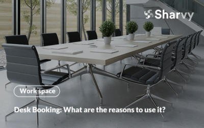
Desk Booking : what are the reasons to use it?
What is desk booking? Who is it for? What are the advantages and disadvantages of this practice? Find the answers here.
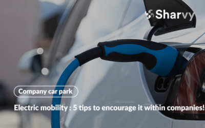
Electric mobility : 5 tips to encourage it within companies!
Find out how to promote electric mobility in the workplace? What solutions are available? Find the answers here.
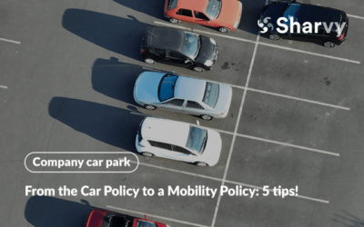
From the traditional Car Policy to a Mobility Policy : 5 tips!
What are the differences between a Car Policy and a Mobility Policy? Which parking policies should you choose? Find the answers here.
Subscribe to our newsletter!
Resources
Contact us
+44 117 463 6990